Analytics for Creative Tools — Canva Tracking Plan
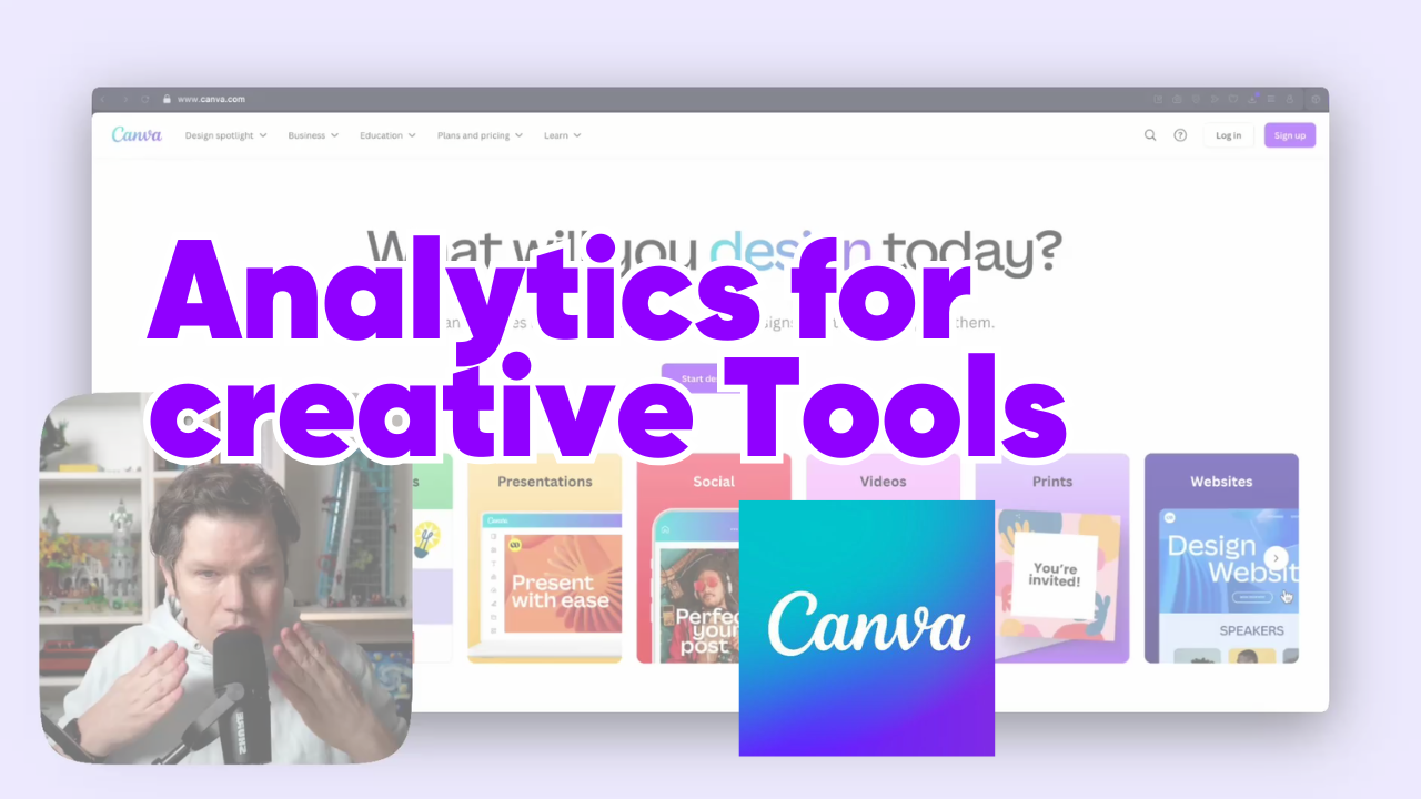
Creating analytics for creative tools like Canva seems like a paradox at first. How do you measure success in a process that’s inherently iterative, personal, and often non-linear? When every color change, text adjustment, or element placement could be tracked, how do you avoid drowning in data while still capturing what truly matters? As someone who has implemented analytics for various products, I faced this exact challenge when approaching Canva’s tracking plan.
The solution wasn’t in tracking more - it was in zooming out to find clarity. This post will show you how to build analytics that capture meaningful insights for creative tools, using Canva as our example. We’ll explore how to identify true success moments, align tracking with strategic goals, and structure your analytics in a way that brings order to creative chaos.
In this content series - season 1, I create a tracking plan for a typical start-up tool every day for four weeks (I take a break on the weekend), so 20 in total. This is the 6th one: Canva. Here is the season overview:
![]()
How to Find Success Moments in Creative Processes: Moving Beyond Click Tracking to Meaningful Outcomes
Why Traditional Click Tracking Fails Creative Tools
When I first approached creating a tracking plan for Canva, I had the same hesitation many analysts face: How do you measure success in a tool where every creative decision could be tracked? The temptation to track every color change, text edit, and element placement is strong - but it’s a path that leads to analytical chaos.
Think about a typical design process in Canva. A user might:
- Add and remove multiple text elements
- Try different colors and fonts
- Move elements around dozens of times
- Switch between multiple templates
- Make countless minor adjustments
The problem isn’t just the volume of data. It’s that granular tracking of creative actions tells us very little about whether users are actually successful with the tool. A user who makes fifty adjustments to their design isn’t necessarily more successful than one who makes five - they might just be struggling to achieve their desired outcome.
This is where traditional click tracking fundamentally misses the mark for creative tools. When I work with clients implementing analytics, I often have to push back against the desire to track everything. You don’t need to know every time someone clicks the color picker or adjusts an element’s position. These interactions create noise that obscures the signal we’re really looking for.
Instead, we need to ask: What actually indicates that a user has successfully achieved their goal? In creative tools, success isn’t about the number of actions taken - it’s about reaching a point where the user feels their creation is worth sharing or using. This is why we need to zoom out from click-level tracking and find more meaningful indicators of success.
The Art of Zooming Out: Identifying True Success Indicators
When creating analytics for creative tools, success moments aren’t always obvious. You have to zoom out from the creative process itself and look for clear signals that indicate users have achieved something valuable.
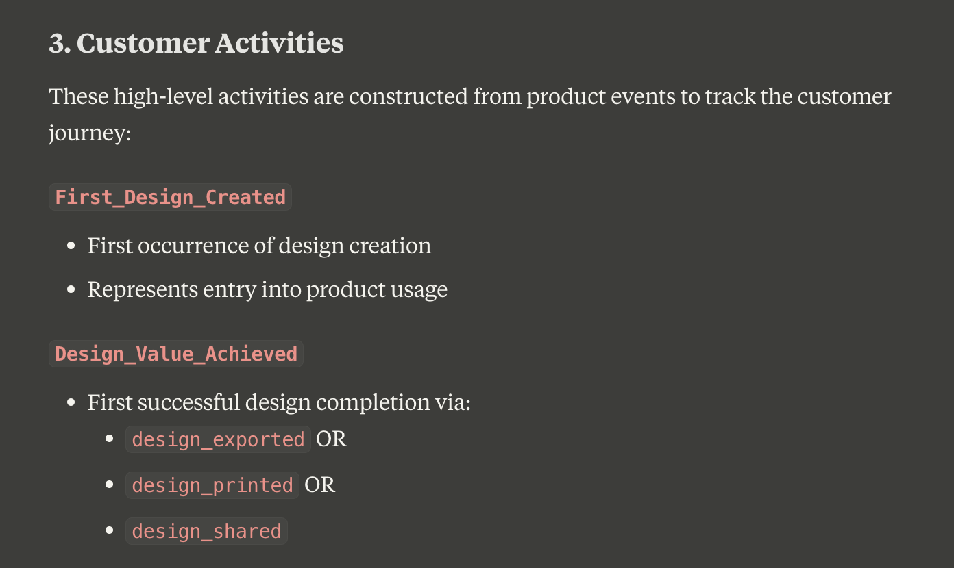
In Canva’s case, there are three unmistakable moments that signal success:
- When a user exports their design
- When they share it with others
- When they send it to print
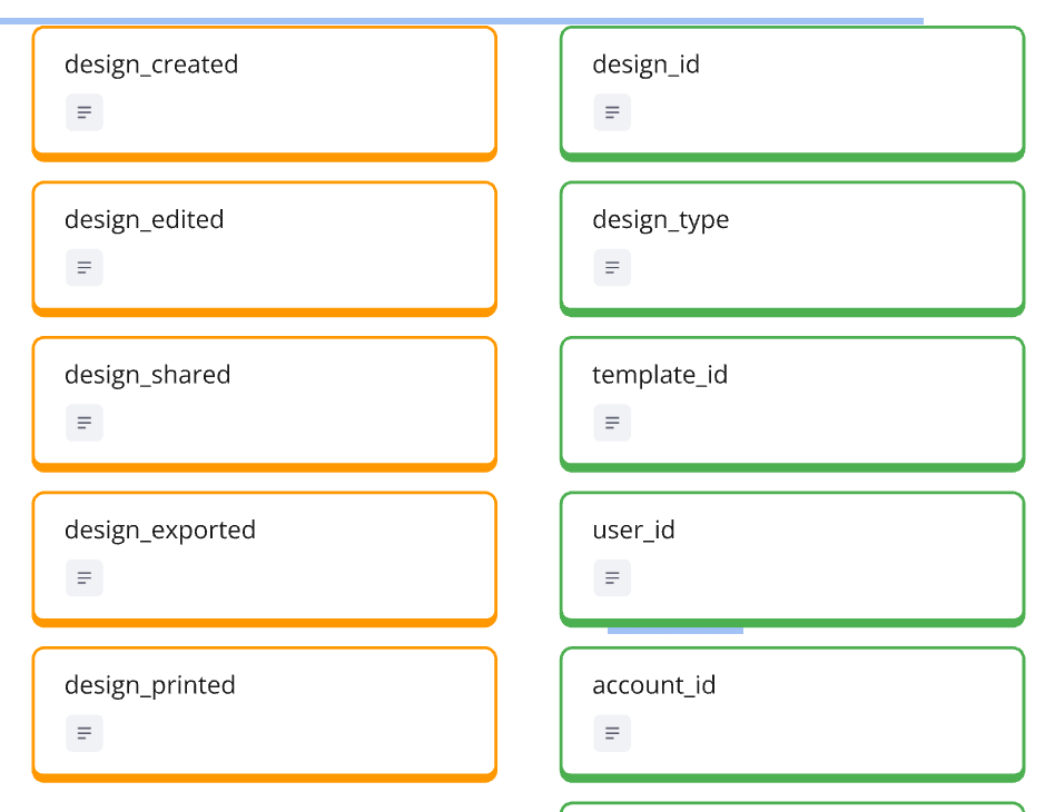
“In Canvas’ case, it’s when I download something, when I share something, or when I give something out for printing. This means I’m happy with the result,” as I explained in the video. These actions tell us something crucial: the user believes their creation is good enough to use or share.
This pattern of “zooming out” works across different creative tools. Take Miro, for example - while users might spend hours moving sticky notes and drawing connections on their whiteboard, the real success moment comes when they share their board with teammates. The sharing action signals that the creative process has reached a meaningful milestone.
Finding these indicators requires asking two key questions:
- At what point do users demonstrate confidence in their creation?
- When does the creative process translate into actual value?
The beauty of this approach is that it cuts through the complexity of creative processes. Instead of trying to measure whether someone is using the tool “correctly,” we’re measuring when they’re using it successfully. This distinction is crucial for creative tools where there’s no single “right way” to achieve an outcome.
Remember: Success indicators should be clear and unambiguous. If you find yourself debating whether something counts as success, you probably need to zoom out further. The goal is to find those moments where user intent is crystal clear - where their actions tell you, without any doubt, that they’ve achieved something valuable.
Turning Success Moments into Actionable Metrics
Once you’ve identified your success moments, the next step is turning them into metrics that can drive product decisions. In Canva’s case, we can combine our success events (export, share, print) into what I call “design value achieved” - a key metric that tells us when users are getting real value from the product.
But identifying the metric is just the start. The real power comes from how you use it:
- For onboarding effectiveness:
- Track time to first “design value achieved”
- Set targets like achieving first success within 7 days
- Measure what percentage of new users reach this milestone
- For ongoing engagement:
- Define active users based on success frequency
- Monitor users achieving design value at least once every 30 days
- Track the distribution of success moments across different user segments
“The other thing we can use it for is to really define active user. An active user for us is like when in 30 days, they at least have two design values achieved,” I explained in the video. This approach gives us a much stronger definition of activity than simple login or page view metrics.
One of the most powerful applications is identifying users at risk. When someone who regularly achieved design value stops doing so, it’s an early warning signal. As I noted in the video, this creates immediately actionable insights - customer success teams can reach out to these users, or growth teams can create targeted re-engagement campaigns.
The key is to build metrics that connect directly to business outcomes. For a tool like Canva, regular achievement of design value likely correlates with subscription retention and expansion. By tracking these success moments, we’re not just measuring feature usage - we’re measuring the actual value users get from the product.
Structuring Analytics Around Strategic Goals: Why Brand Kits and Templates Matter More Than Button Clicks
Understanding Your Product’s Strategic Layer
Product analytics often starts with tracking core functionality, but the real power comes from understanding and measuring your product’s strategic direction. The challenge is finding these strategic elements - they’re not always obvious in your day-to-day analytics.
For Canva, I found clear strategic signals right on their homepage:
- “Easy to create” - indicating a focus on accessibility
- “Professional designs” - showing their quality aspirations
- “Share or print” - highlighting their end-to-end solution
“The sub headline is a good indicator. We can pick easy, create, professional designs. Easy to create, then professional designs. We are creating professional designs and it shouldn’t take us long to do this,” I noted in the video. These aren’t just marketing messages - they’re strategic priorities that need to be measured.
Finding your product’s strategic layer typically comes from two sources:
- External messaging: Homepage headlines, product marketing, and sales materials
- Internal direction: Company strategy, go-to-market plans, and revenue models
The key is connecting these strategic elements to measurable outcomes. For instance, Canva’s push into enterprise markets isn’t just about having enterprise features - it’s about measuring how those features drive business transformation. Their Brand Kit functionality isn’t just another feature; it’s a strategic tool enabling corporate identity management.
When incorporating strategic direction into your analytics, ask yourself:
- What differentiates your product in the market?
- Which features or capabilities support your long-term vision?
- How do these strategic elements contribute to revenue growth?
Remember: Your analytics setup needs to grow beyond tracking basic product usage. It should help you understand whether your strategic initiatives are actually working and driving the business forward.
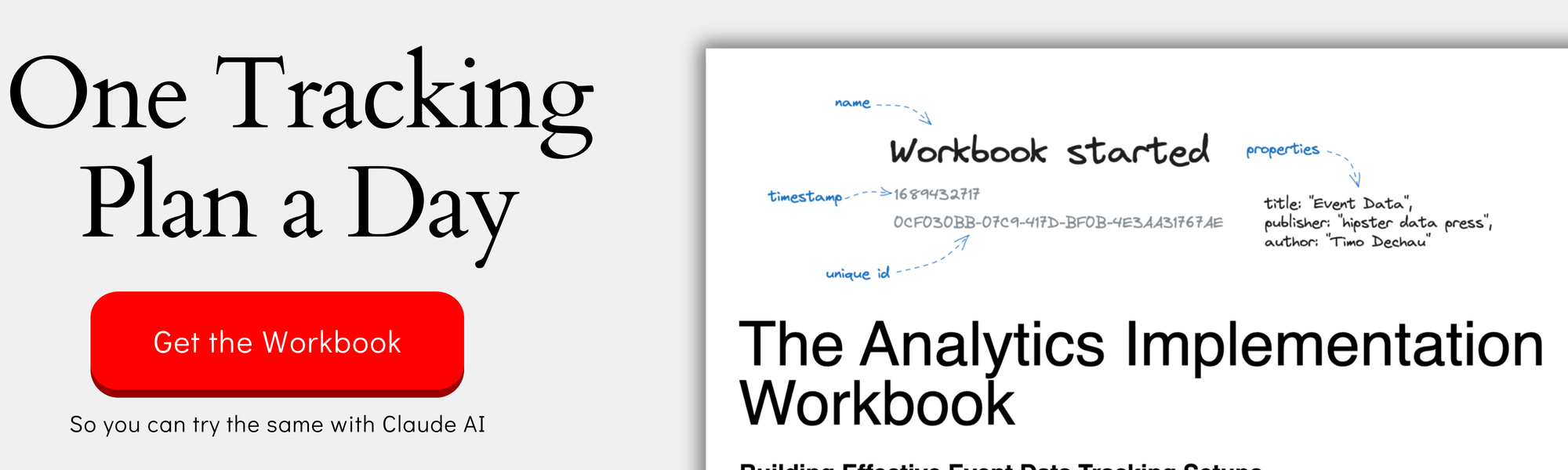
This work is based on the chapters about event data design in my book Analytics Implementation Workbook. There, you can read more details about the D3L framework.
Elevating Strategic Features in Your Analytics
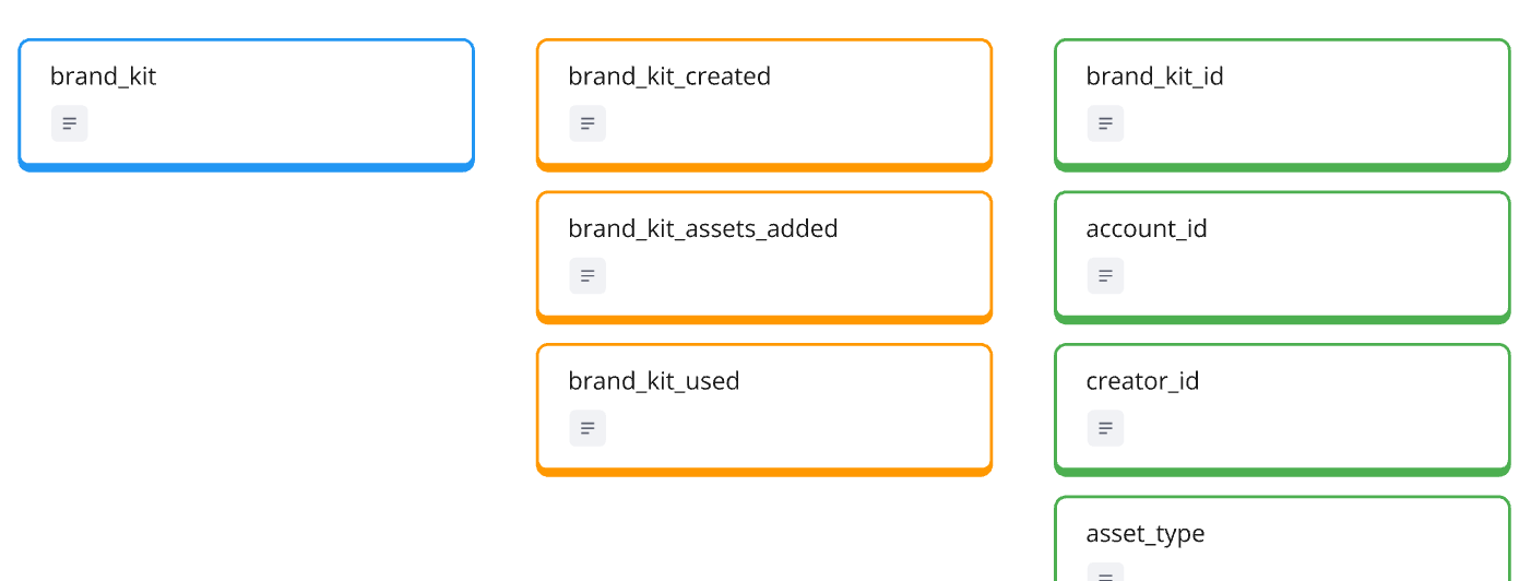
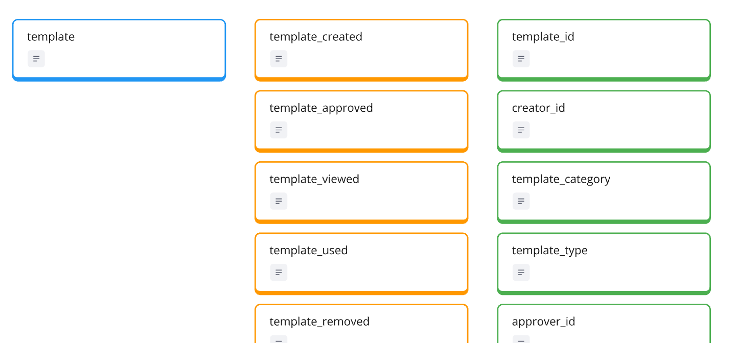
When designing analytics for strategic features, sometimes you need to break conventional tracking patterns. A perfect example is how we handle Canva’s Brand Kit and Templates - by elevating them to full entity status rather than treating them as simple activities or properties in other entities.
“By making it an entity, we’re making it a strategic item. It makes it easier then for people, when they go into the analytics setup, to say, ‘hey, I want to understand how our brand kit initiatives are doing,’ so they will immediately find the right kind of events for it,” I explained in the video. This isn’t just a technical decision - it’s about making strategic initiatives visible and measurable.
For templates, this elevated status means tracking the complete lifecycle:
- Creation by designers
- Approval process
- User adoption
- Usage patterns
- Performance metrics
This approach serves multiple stakeholders:
- Design teams can track template performance
- Product teams can measure template adoption
- Business teams can analyze template impact on conversions
The key is making strategic features discoverable in your analytics. When a feature is buried as a property or merged into general usage metrics, it’s harder for teams to track and optimize their strategic initiatives. By elevating these features to entity status, you’re signaling their importance and making their impact more measurable.
This doesn’t mean every important feature needs to be an entity. The decision comes down to two factors:
- Is this feature core to your strategic direction?
- Does separate tracking provide valuable insights for multiple teams?
When the answer to both is yes, consider elevating the feature in your analytics structure. This makes it easier for teams to find, measure, and improve these strategic elements without getting lost in general product metrics.
Connecting Strategic Success to Business Growth
Strategic features aren’t just product enhancements - they’re business growth drivers. When we track them correctly, we can directly connect product usage patterns to business outcomes. In Canva’s case, their Brand Kit feature is a perfect example of how strategic analytics can inform business growth.
Here’s how this connection works in practice:
- Track adoption rates across organization sizes
- Monitor the number of brand assets being created and shared
- Measure how brand kit usage correlates with subscription upgrades
- Identify which teams are becoming power users
“I add a brand kit as an entity because I also wanted to cover an interesting case that I haven’t covered so far. It’s also like an interesting spin because Canva was always a very B2C like tool, but now to see them, how they basically create this loop to also include B2B use cases,” I explained in the video.
This strategic view helps multiple teams:
- Sales teams can identify accounts ready for expansion
- Customer success can spot accounts needing activation
- Product teams can measure enterprise feature adoption
- Marketing can demonstrate ROI for premium features
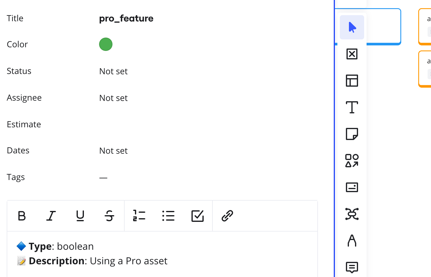
One crucial aspect is adding the right properties to your tracking. For example, adding a “pro_feature” property to usage events lets you:
- Calculate the percentage of pro feature usage in free accounts
- Identify accounts likely to convert to paid plans
- Measure the actual value premium features provide
The goal is creating a clear line from strategic feature usage to business metrics. When you can show that accounts using Brand Kit features are more likely to expand their subscriptions or that template usage correlates with long-term retention, you’re proving the business value of your strategic initiatives.
Remember: The best analytics setup isn’t just about tracking what users do - it’s about understanding how those actions drive business growth.
From Complexity to Clarity: Building a Three-Layer Analytics Framework for Creative Tools
The Product Layer: Building Your Analytics Foundation
The product layer forms the backbone of your analytics framework. For creative tools like Canva, this means identifying the core entities that drive user value without getting lost in the endless possibilities of creative actions.
Start with your foundational entities:
- Account & User: Essential for tracking both individual and team usage
- Design: The core creative output that drives value
- Strategic entities: Like Templates and Brand Kit that support business goals
“We always have this one entity, which I always call the heartbeat entity, which is driving the whole thing,” I explained in the video. “Yesterday I had Asana, obviously there it is the task. Before I had Vimcal, there it is the event. Then I had Superhuman, there it is the email. You always have this entity that basically if this keeps tracking for an account or for user, you’re in good shape.”
For Canva the heartbeat entity is the Design. Everything exists because of it and everything is built around it.
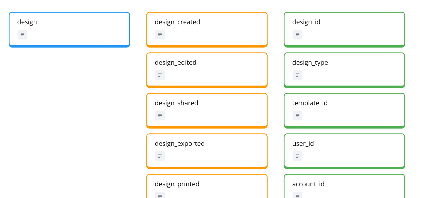
For each entity, define key activities that signal progress and success:
- Creation moments
- Meaningful updates
- Success indicators (like export, share, print)
- Strategic actions (like template usage)
Then add properties that provide crucial context:
- Pro vs. free features
- Usage environment
- User role or permissions
- Content type or category
Remember: The goal isn’t to track everything possible, but to create a foundation that captures meaningful product usage. You can always add more tracking later, but starting with a clean, focused product layer makes future analysis much more effective.
The key is finding the right balance - enough detail to understand product usage patterns, but not so much that you create noise in your analytics. When in doubt, ask yourself: “Will tracking this help us make better product decisions?”
The Customer Layer: Measuring Progress and Growth
While the product layer tracks what users do, the customer layer measures how they progress and grow. This is where we translate individual actions into meaningful patterns of success and engagement.
For creative tools, the customer journey typically follows these stages:
- New users getting started
- First success moments
- Regular usage patterns
- Power user behavior
- Risk signals
“I love this, this is my kind of favorite customer activity or customer profile. Because it gives us something where we can immediately put it into action,” I noted in the video when discussing at-risk users. This is where analytics becomes truly actionable.
Instead of just tracking individual design creations, we want to identify key transitions:
- When does someone move from experimenting to regular usage?
- How quickly do they achieve their first successful design?
- What patterns indicate they’re becoming a power user?
- Which behavior changes might signal they’re at risk?
For Canva, we might define these states as:
- Regular designer: Creates and shares designs consistently
- Team collaborator: Uses collaboration features actively
- Brand manager: Utilizes brand kit features extensively
- At risk: Previously active but showing declining engagement
The power of this layer is its ability to drive action. When you identify users at risk, customer success teams can intervene. When you spot potential power users, sales teams can explore expansion opportunities. These insights drive business outcomes, not just analytics reports.
Remember: The customer layer isn’t about individual events - it’s about patterns that indicate progress or problems. By understanding these patterns, you can proactively support users throughout their journey.
The Interaction Layer: Keeping Click Tracking in its Place
Yes, sometimes you need to track clicks - but let’s be smart about it. While your product and customer layers focus on meaningful outcomes, the interaction layer handles those occasional needs for detailed UI analytics without overwhelming your tracking plan.
Instead of creating separate events for every button or interface element, use a single standardized approach:
- One event type: “element_clicked”
- Rich properties for context
- Clear naming conventions
- Focused implementation
“Sometimes you need clicks, as I said, sometimes the UX designer really want to know, ‘okay, we have this new background removal feature and I really want to know which kind of options are people actually using,’” I explained in the video. This is a valid need - but we can handle it without creating analytics chaos.
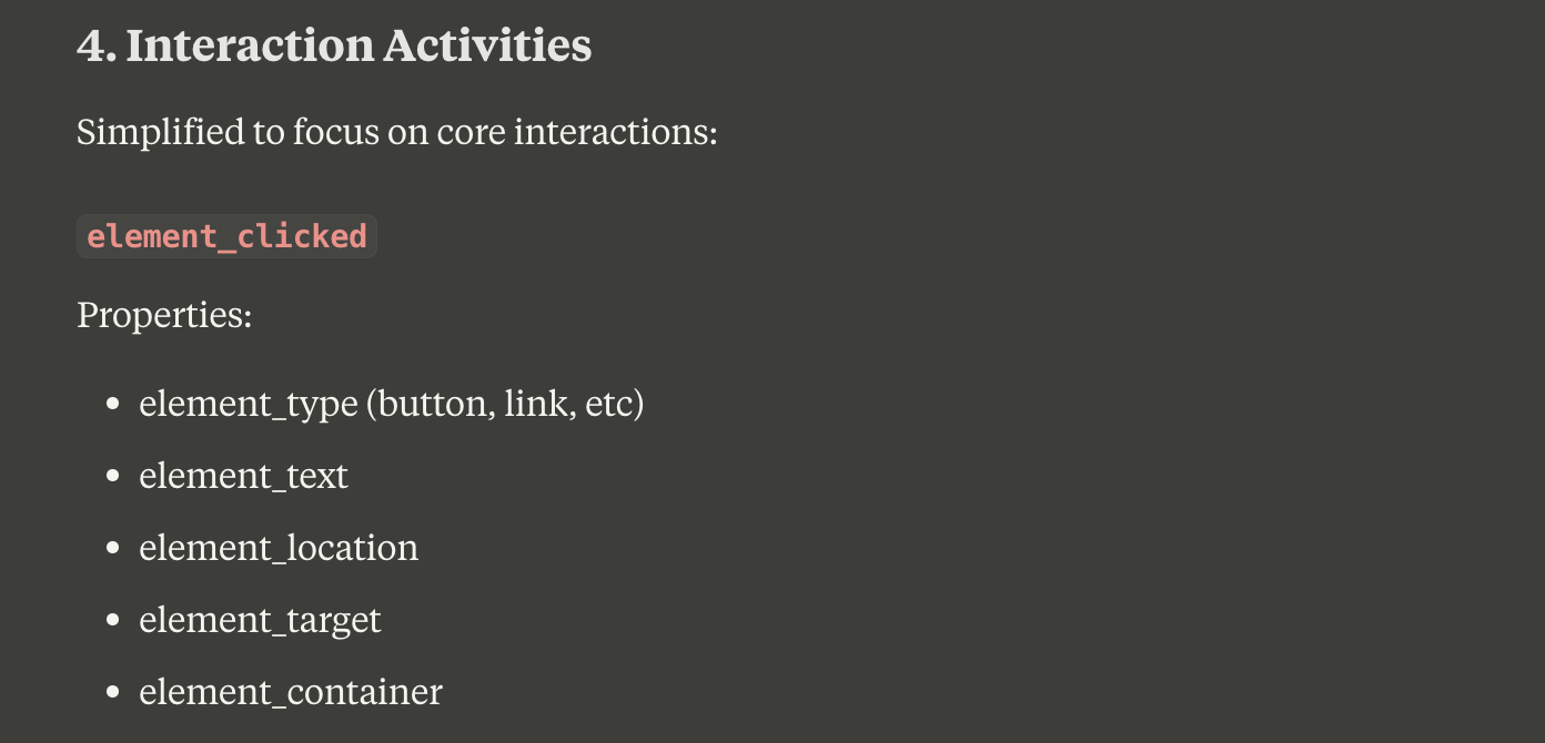
Structure your click events with consistent properties:
- element_type: “button”, “link”, “menu_item”
- element_text: The visible text or label
- element_location: “top_toolbar”, “side_panel”
- element_target: The action or destination
- element_container: The feature or section context
This approach gives you flexibility without complexity:
- UX teams can analyze specific interface elements
- Designers can track new feature adoption
- Product teams can investigate user patterns
- All without cluttering your main analytics
Remember: Click tracking should support your analytics, not dominate it. Keep it contained in the interaction layer, and make sure it’s serving specific, valuable purposes. For deep UX insights, complement this data with session recordings and user interviews - they’ll tell you more about user behavior than click tracking ever could.
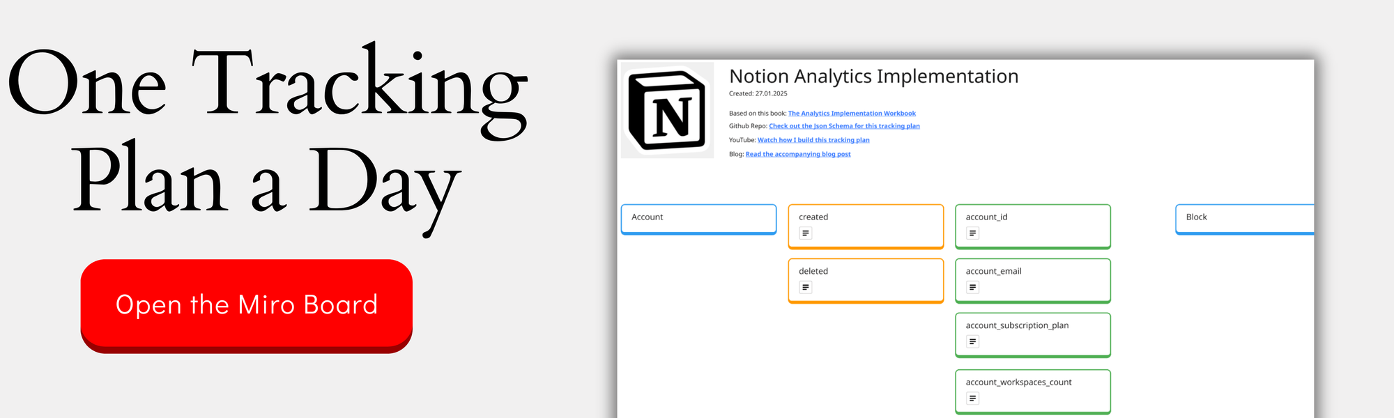
You can check out the complete design on the Miro Board:
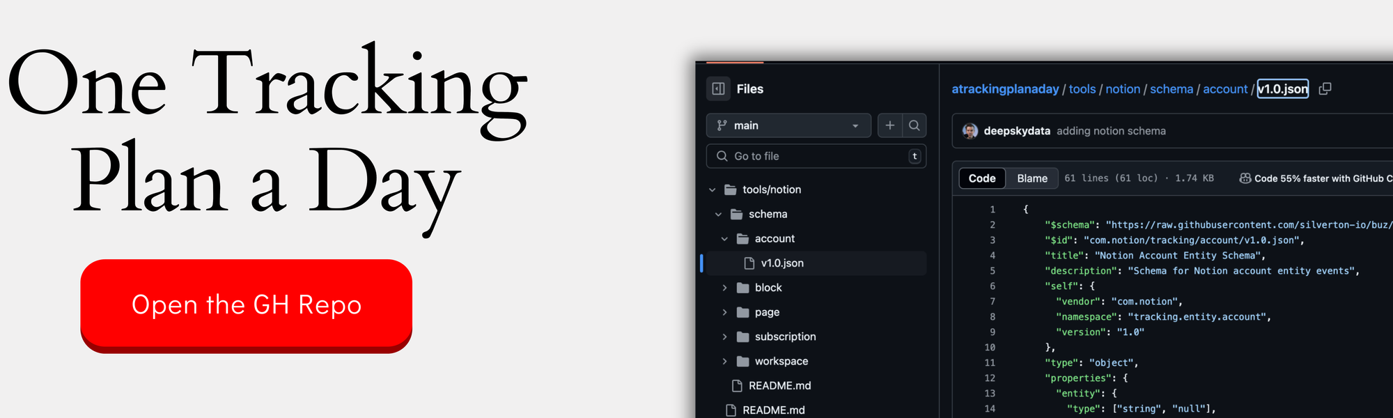
If you want the nerdy version, you can check out the JSON schemas here:
When measuring success in creative tools, the temptation to track everything is strong. But as we’ve seen through Canva’s example, the power lies in zooming out to find meaningful signals amidst the creative chaos. By focusing on true success moments, elevating strategic features, and structuring analytics in clear layers, we can build tracking systems that actually inform product decisions.
The goal isn’t to capture every creative decision, but to understand when and how users achieve value. Whether you’re working with design tools, digital workspaces, or any product with complex user journeys, this approach helps you find clarity in complexity. The best analytics aren’t about tracking everything - they’re about tracking what matters.
This was part 6 in our series “One tracking plan a day” Season 1 - startup tools. Make sure you visit all other parts of the series:
- Notion - 27.01.25
- Slack - 28.01.25
- Superhuman - 29.01.25
- Vimcal - 30.01.25
- Asana - 31.01.25
If you like to generate your own tracking plans by using my book with Claude AI, get your copy here:
This work is based on the chapters about event data design in my book Analytics Implementation Workbook. There, you can read more details about the D3L framework.
Join the newsletter
Get bi-weekly insights on analytics, event data, and metric frameworks.